
I chose WordPress to create my blog because I like the template designs available and the customization features. I liked the look of the Sela design and selected that template as my starting point. It has a very clean feel but also adds in a little color where the links are for the other pages.
I changed the default font because unfortunately, even though I really liked it I couldn’t tell what it was and it was only labeled as default font. I selected Oswald as my heading font which is a san-serif font. I like the dark, clean, simple look but it also made the text stand out. The content text is also a san-serif font called lato. I do prefer a very simplistic look in design but, I think balance is equally important.
In the Zen Design text it states that, “Constraints and limitations are wonderful allies. They lead to enhanced creativity and ingenious solutions that, without constraints, might never have been discovered” (Reynolds 2014). I found this to be very true in selecting my fonts for the blog. I normally would have selected my go to san-serif fonts right away; arial, gothic, or helvetica but instead I was limited to what was available within the free WordPress template and this made me branch out and try something different. So often we get comfortable using the same things over and over and it’s nice to have to rethink that and try something new.
The template picture at the top of this post seemed fitting with the blank pages of paper so I just kept what was already there. I am starting from scratch and could have easily written this using a pen and paper and am instead using a technological tool. I’m trying to take from the book that we should obsess about our ideas and not the tools. So often we can get hung up on the creation or learning how to use the technological tool and we forget that what we write and the message we are trying to convey is really the most important factor.
References
Reynolds, G. (2014). Presentation zen design: A simple visual approach to presenting in today’s world (2nd ed.). New Riders.
Wordle – Beautiful Word Clouds. (n.d). Retrieved May 21, 2016, from http://www.wordle.net/

Nice touch color coordinating the page header with the wordle. It’s all about the small details!
LikeLike
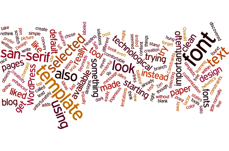
I really like that your Wordle focused on the textbook – very interesting! Fonts really stood out to me in our reading too. I’ve never put that much thought into the more plain, classic fonts until reading ch. 2 of our text. Usually I get stuck scrolling through font after font looking for a cute one to use, but have been convinced to let go of Comic Sans after reading our book! Your blog looks great – clean and simple!
LikeLike
I loved the color! It was so pretty and made me feel happiness! I want to feel more comfortable with adding slight details and I feel like the way you added the color without overwhelming the eye was subtle and very well chosen. I too, being in the elementary setting often try to add the “cute” things to visuals for my students. I often feel overwhelmed by it but fear without them I won’t grab my students attention. Your blog is beautiful!
LikeLike